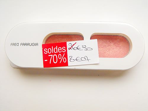
 And here we have the second review of Fred Farrugia's eyeshadow duos. You can view the first one here. This was the first one I bought, because as I was rummaging through the palettes, I stumbled upon this one and my first thought was 'Oh wow, that colour looks like Nars Orgasm!' and I have always thought that Nars Orgasm would be so pretty as an eyeshadow.
Of course, after quickly going over to the Nars counter, I quickly found out that this was a lot paler than Orgasm. Oh well, wouldn't have been much of a dupe anyway, considering how expensive it is!
 You can't see the gold shimmer much in this picture, but aren't they pretty? I've always loved the pink/gold combo and in fact, I am later on going to see what Barry M's pink gold looks compared to this one, cause if it is similar, all those who may want this colour can save a fortune and buy a dazzle dust instead.
 The funny thing about this duo is..I can't find it online. I've looked on the official FF site and nothing there. Sephora? Nada. It's very peculiar...
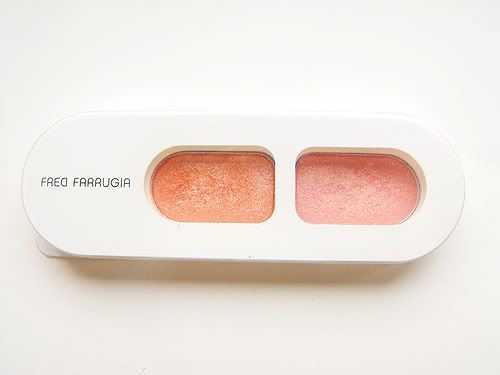
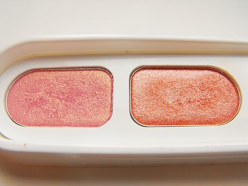 Here you can see the colours a little better. So you have the pink/gold combo, which I've already mentioned and then the orange with silver shimmer, which is quite nice as well. They're both colours I love as these colours will make blue eyes pop (which is what I need, trust me!)
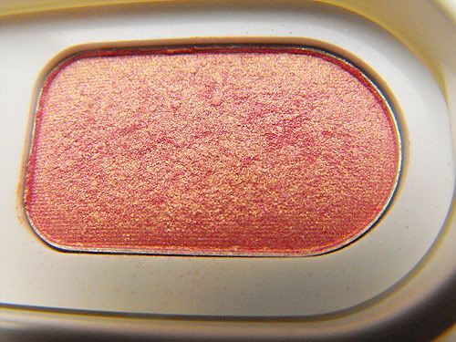 This picture is a little bit shoddy and doesn't really do the colour justice. You can see the gold in it though, although in reality, the pink is a bit paler. I adore this one as I have always had a thing for pink and gold and it's just so pretty and I should stop cause this is getting corny. It isn't perfect though, don't get me wrong! As with all shades that have glitter, you have fall out of the if-you-don't-clean-off-properly-you-will-look-like-edward-cullen-on-your-cheeks variety. Ah well, you can't have everything.
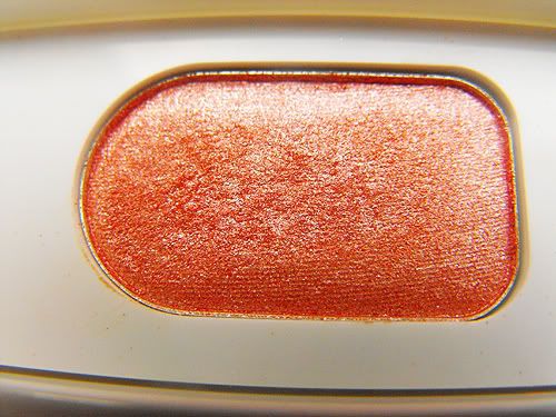 Now this is a bit more of an apt photograph. Here you can see it's orange, and it's got a silver highlight although it's not as obvious as the gold with the pink, the silver is a lot subtler in this one. I really like this one, as my other oranges aren't really all that sublte enough for daytime, but thankfully this one is, if applied sparingly!
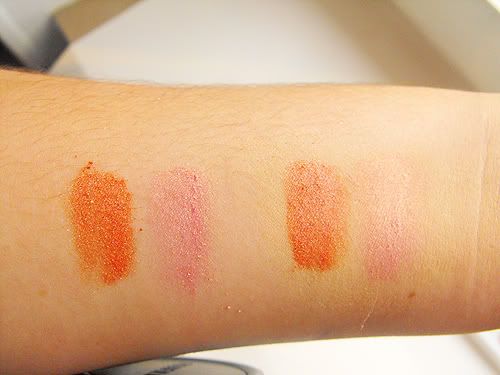 Left we have without primer, right with UDPP. The orange is far more pigmented than the pink and the primer doesn't really seem to make a lot of difference in the picture, but with staying power and such, it does help the shadows stay on. They're both quite pigmented on their own, which is great and well, should be expected considering how much they retail at.
So all in all, I really like these, they're both subtle enough for daytime and the colour choices are just gorgeous! I'm sorry if the last bit seemed a bit rushed, I just want to publish this as I won't have time on Saturday, as I've already said, I shall be in Paris! :D xx

No comments:
Post a Comment